EagleShare Brand Identity
www.eagleshare.com brand identity for responsive web and mobile application

Brand Identity for EagleShare.com
Mission & Vision:
Mission: To empower individuals to explore freedom and adventure through convenient, accessible, and sustainable motorcycle sharing.
Vision: To become the leading motorcycle-sharing platform, fostering a vibrant community of riders and revolutionizing the way people experience transportation.
Brand Voice:
Friendly and approachable: Using language that is easy to understand and welcoming to all.
Enthusiastic and passionate: Conveying the excitement and joy of motorcycling.
Informative and transparent: Providing clear and accurate information about the app and its services.
Inspiring and motivational: Encouraging users to explore and embrace adventure.
Logo Variants
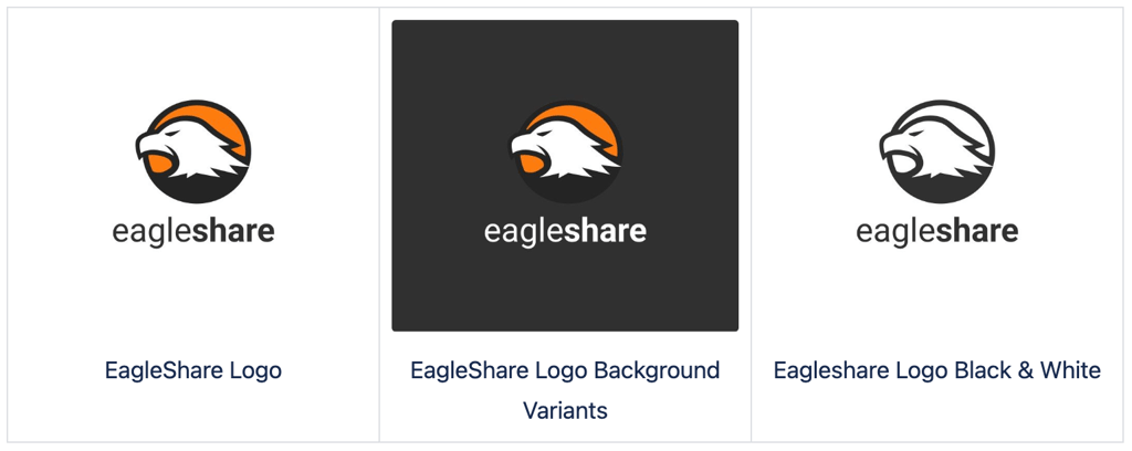
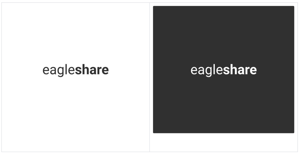
Wordmark
The wordmark is for applications where the regular EagleRider logo cannot be used due to size constraints or readability.
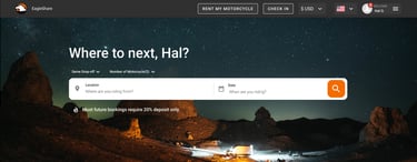
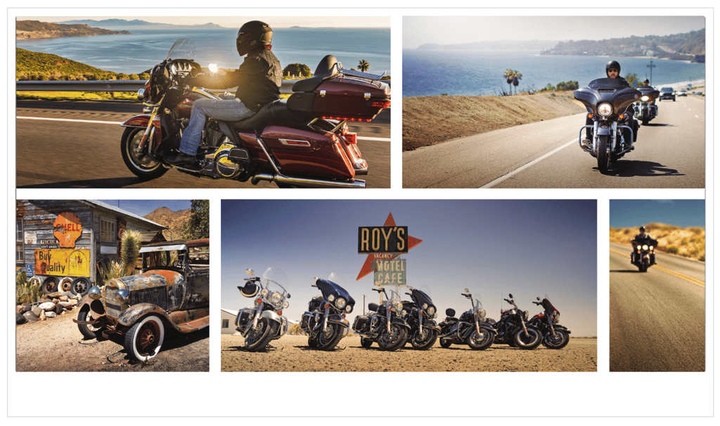
Selecting Photography

Photography should clearly translate our brand pillars into visual representations.
Brand imagery must convey the magnitude of the entire EagleShare experience, in which the bike is secondary to the incredible people and experiences that surround it. Images depicting social groups that span generations traveling together across iconic American landscapes including mountain, desert, and ocean backgrounds should be showcased. Photography should be shot and planned with an editorial eye, but not lack in authentic detail, as we believe it is those details that make the experience. We encourage the use of rugged but not rough models,
and photos should be warm in tone with an overall dreamy, aspirational feel
Photography style
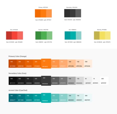
Color Scheme
eagleshare color palette is designed to align with the Material UI React library. Utilizing the Material Design color system allows for the creation of a cohesive color theme that embodies your brand identity or preferred style.

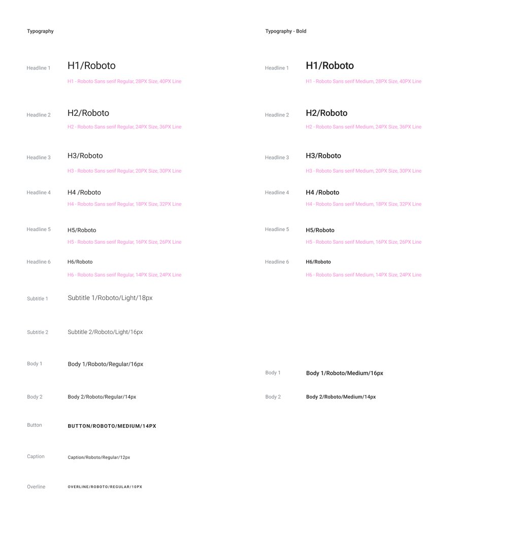
Typography